
Sep 9
Design a fix for square sponsor logos looking small
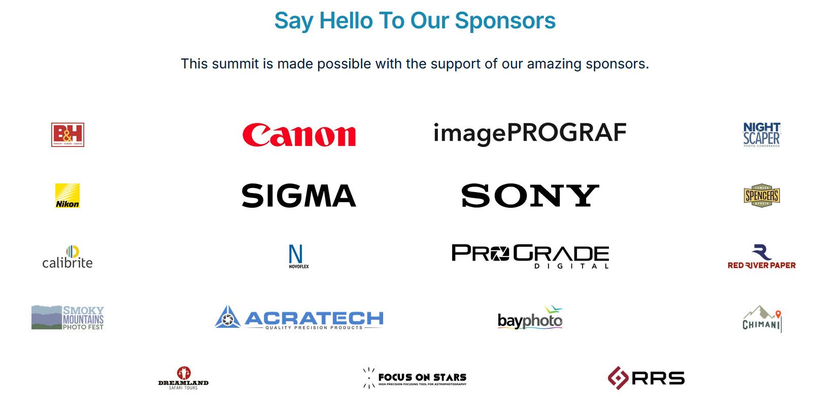
When using the Sponsors component, horizontal logos look good, but square logos look tiny. The reason appears to be that the logo containers are horizontal, so any graphic that is not horizontal get minimized. On the flip side, any horizontal logo that happens to have the same proportions of the container end up looking giant. Ideally, all the logo would have the same visual weight.
I’m not sure what the ideal fix it, but it would be great if something can be done about it.
1) Make the containers square? This might be better, but would probably be a half measure, because then square graphics would look bigger than others.
2) Perhaps a setting in each logo to tell HeySummit whether a logo is horizontal, vertical or square, so that the display size can be automatically optimized?
3) A setting (probably in the Manage Sponsor settings) for a relative size (smaller, small, medium, big, bigger — kind of like relative font sizes in HTML)? Then the event developer can eyeball what looks best? (This could also help event organizers who want to make logo sizes different based on sponsorship tier.)
Completed
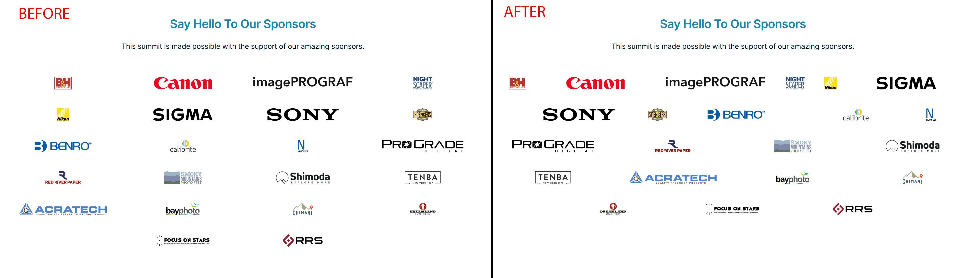
Hi Chris - thanks for sharing this. No doubt we’ll need to further improve this as time goes on, but hopefully what we’ve done today will help make square logos more prominent. You can read more about the changes we’ve made on the link below: https://heysummit.userjot.com/updates/p/new-logo-shape-setti… Hope this helps